Apple has a deserved reputation for for producing beautifully designed and made hardware. The iMac, the MacBook Air, the iPhone all are simply wonderful to use and to look at. But their appeal is more than just the surface; yes they look lovely on the shelf but it’s when you start to use them you appreciate the thought that has gone into all aspects of their design.
I was struck by this yesterday when I spent 30 minutes and two password resets trying to log into the expenses system at work; a system so bad that once you are logged in you generally wish you weren’t but that’s another story.
 It was only when I gave up and went to use another system that I realised I had caps lock switched on. You see on the cheesy Dell keyboard I have at work and in fact all PC keyboards I have used, the caps lock key is on the left but the dim indicator light is over on the top right – about as disconnected as you can get from the button itself. Who thought that was good interface design?
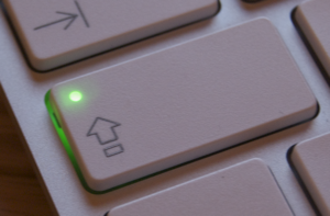
Now, on Apple keyboards the indicator light is on the caps lock button itself, even on the iPhone the button itself changes. Isn’t that just so much more sensible? All it took was for an designer to say “hang on, why is the light over there but the button over here? Let’s change it.” and they did.
It’s not that Apple “Think Different” but they actually just think think about the user experience and how it can be the best it can be. Clearly other manufacturers do not.