Notes From Afar

Tag: User Interface (page 1 of 1)

Winning Awards For mybarclaycard Design

mybarclaycard is Barclaycard’s new online card account management site which launched late last year. I led the User Experience and User Interface design and development, and believe we created a unique and revolutionary site years ahead of Barclaycard’s competitors.

So it is nice to see mybarclaycard being recognised, and winning awards in both the financial services and wider design communities.

mybarclaycard won Best Online Initiative at the Card Awards. My favourite comment from the judges was “What everyone else ought to be doing”. Download their full summary.

And mybarclaycard has been commended by Design Week; with Barclaycard the only financial services company nominated.

It is only now I’ve had some space from the project and from the business, and seen the challenges prevalent in other large corporate bodies that I can appreciate just how bold and brave a project mybarclaycard was; especially for a bank.

I’m proud to have been part of the creation of mybarclaycard, and hope that Barclaycard continue to enhance and develop it. I can’t help but think about how awesome a mybarclaycard iPad app could be.

Sony Ericsson Xperia Pureness

I love my iPhone, I really do, but every now and then I find myself hankering for something simpler, smaller and well just different. I think the new Sony Ericsson Xperia Pureness could stop that hankering.

The display is monochrome (gasp) but also transparent as demonstrated in this video:

The keyboard is invisible until activated; so half the phone is transparent while the other half is invisible.

Amazingly the Xperia Pureness is an HSDPA phone and has a web browser, although I’m not sure how good the browsing experience will be on a mono transparent screen, but then again I guess that’s not the point. The Xperia Pureness doesn’t even have a camera, but it does have access to a concierge service à la Vertu.

The only problem…the price: £600 and only from Selfridges.

Google Quick Search – The New Quicksilver

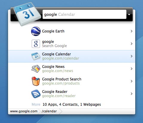
I’m playing with a cool new app on my Mac that shows great promise: Google Quick Search Box.

Google Quick Search Box

Developed by Nicholas Jitkoff, the developer behind the once great, but now sadly orphaned Quicksliver, Google Quick Search aims to combine Google Search with Spotlight search in one package. But, as with Quicksilver Google Quick Search is able to do much more than just launch apps and documents allowing you to drill down and carry out actions with your data; for example moving a document to a different folder.

Google Quick Search Box Open

I say that Google Quick Search shows promise because this release is described as a developer release; I’ve had a few crashes and also found it unable to play a track or artist in iTunes. This aside I have also found it more intuitive and easier to use than Quicksilver. With Quicksilver I did little more than launch apps but I can see myself using Google Quick Search for much more as it develops.

WordPress 2.7

A few days ago I upgraded davidhughes.org to the newly released, and latest version of WordPress: 2.7.

When I saw the first shots of the new dashboard and IA for WordPress 2.7 I was  concerned that the changes were too great and perhaps not being done for the right reasons: change for changes sake. But having had a few days to play with WordPress 2.7 I’m very pleased with the new approach.

The most significant change in the completely new interface is the move form horizontal navigation across the top of the page to vertical navigation on the left. I’ll admit that this change gave me a few muscle-memory moments, where I out of habit moved my mouse to the top; but it’s amazing how quickly you adapt.

This new navigation gives WordPress much more flexibility to add new features in the future as they are no longer constrained by the width of the average browser window. I’m pleased to report that this new layout also works very well, if not better, on the 10″ 1024×600 pixel screen of my Samsung NC10 netbook.

In addition to the great new user interface there are a number of other new features and enhancements in WordPress 2.7; a favourite of mine being  the ability to upgrade from within the WordPress dashboard.

WordPress has  a very good introduction to 2.7 on their site that also explains the thinking behind the developments.

In my opinion the best blogging platform just got better; I can’t wait to see what WordPress 2.8 brings…

Google Adds Tasks to Gmail

You may have seen the news that Google has added a tasks application to its Gmail email service.Well the even better news is that since they recently added Google Labs to Google Apps email I get to play with it also.

I’ve tried a number of task apps over the years and not found one that I could stick with and met my varied but rather basic needs but tasks from Google looks promising.

I like that it is in my email but can also be “popped out” to float as it’s own window.

I like that because it is web based I can access from both my iMac and my Samsung NC10 running XP.

I like that you can easily make an email a task; most of my tasks seem to arrive via email.

I really like its simplicity: tasks, sub tasks, due dates and that’s about it.

I rather hope that Google don’t develop it much further than this, but if they do they make new features configurable. I’ve been put off other task applications by the complexity or multiple stages of simply adding a task and would hate to see that happen here.

Additions I would like to see are:

  • the ability to view and edit tasks from my iPhone
  • a “quick add” function like that found in Google Calendar
  • some kind of self-contained tasks view which could be off-line via Google Gears

I love the almost constant upgrades and additions that Google makes to its services such as Gmail, Docs, Google Apps etc. particularly when you consider they are all free.

Helvetireader

Jon Hicks has just launched Helvetireader a wonderfully minimalist yet superbly usable theme for Google Reader.

I’ve used Google Reader as my RSS application of choice despite it’s rather cluttered and ugly interface; I mean what is it with Google and pale blue?

Anyway, I’ve tried the Better GReader plug-in and a few other themes but none really worked for me; that is until now.

Helvetireader is frankly beautiful. It makes the news articles the focus of its design and removes all of the cruft and extraneous clutter that the Google Engineers have added.

Jon says:

I was going for minimal, inspired partly by Times, a newspaper style RSS reader, and the postcards that came with the (Deluxe!) Helvetica Film DVD.

He has succeeded wonderfully; although I now wish I’d bought the Deluxe version of Helvetica.