Notes From Afar

Tag: Design (page 8 of 9)

Free Hugs

I just saw this video on Garr Reynold’s posterous blog and thought I’d share it with you; as Garr says it’s hard not to smile.

Garr Reynolds is the author of Presentation Zen a brilliant book on presentations and visual design. If you write or create presentations you should read this now. PLEASE.

Garr is based in Japan and his posterous blog is a fascinating stream of visuals from Japan and around the world. I highly recommend subscribing to the posterous blog or following Garr on Twitter.

His main blog Presentation Zen is also a great read with more in depth articles on presentation style and visual design.

Command Prints

Remember when the web was a daily voyage of exploration? When you would literally “surf” from site to site following almost any link? Remember the days before RSS readers and bookmark collections?

Well I had a wonderfully retro moment of surfing exploration this morning; a Tweet from Elliot Jay Stocks led me to Sam Brown’s website, which I’d not been to before, which then in turn led me to these wonderful prints and a site called  My Little Undergorund.

I love the use of the Mac keyboard symbols and shortcuts as part of a “serious” message on these prints. I’ve been looking for some new prints and pictures for my home office so didn’t hesitate in ordering a set of these fantastic prints – I can’t wait for them to arrive.

I think my next decorative purchase may be a Keep Calm and Carry On poster, I just wish it wasn’t so red.

Seeing the Signs

I love this signage created for a carpark in Melbourne, Australia.

So often car parks have unclear or confusing signage but there’s no missing them here; in fact the down sign looks as if you might crash into it.

It’s the Little Details

Apple has a deserved reputation for for producing beautifully designed and made hardware. The iMac, the MacBook Air, the iPhone all are simply wonderful to use and to look at. But their appeal is more than just the surface; yes they look lovely on the shelf but it’s when you start to use them you appreciate the thought that has gone into all aspects of their design.

I was struck by this yesterday when I spent 30 minutes and two password resets trying to log into the expenses system at work; a system so bad that once you are logged in you generally wish you weren’t but that’s another story.

Caps Lock Done Right
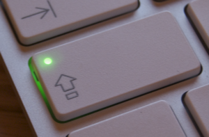
It was only when I gave up and went to use another system that I realised I had caps lock switched on. You see on the cheesy Dell keyboard I have at work and in fact all PC keyboards I have used, the caps lock key is on the left but the dim indicator light is over on the top right – about as disconnected as you can get from the button itself. Who thought that was good interface design?

Now, on Apple keyboards the indicator light is on the caps lock button itself, even on the iPhone the button itself changes. Isn’t that just so much more sensible? All it took was for an designer to say “hang on, why is the light over there but the button over here? Let’s change it.” and they did.

It’s not that Apple “Think Different” but they actually just think think about the user experience and how it can be the best it can be. Clearly other manufacturers do not.

I’m Flattered

I’ll preface this post by saying I should probably tag it with “ego” and “ego-centric” but hey…

Over the last couple of weeks I’ve had some really nice feedback on davidhughes.org, all of which has meant a lot to me.

First, I had a lovely compliment on my writing.

Then, a compliment of my use of typography in the design.

Then, I was contacted via Flickr asking if I could make a WordPress theme from my design – sorry that’s way beyond me, but thanks very much for asking.

And then today, whilst perusing my Mint statistics I found a referrer from del.icio.us tagged with “inspiration”. I’m amazed and humbled.

It’s great after almost 4 years of this blog/journal/site, in it’s many forms and names, to receive such lovely compliments.

It’s particularly good to receive positive feedback on the design as I have a bit of a love/hate relationship with it. When I’m not looking at it I think it’s un-inventive and dull but then when I see it again I rather like it. I’m pleased other feel the same.